Roundup Post Product Grids - With Examples!
Affiliate Examples #4 How are other sites showing products in roundup posts? Is there a best way of using a grid?
Firstly, a really quick intro - Hi! I’m Richard, and I’ve taken the reins for this project over from the creator and previous owner, Luke, so I hope you can get a few ideas from the newsletter now and going forwards. If you signed up from Luke’s tweets or YouTube videos then I’m sending you a massive thank you! (and if you didn’t, then you really should subscribe to his channel and check out some of the videos that he’s produced!)
If you’re new here, then welcome! I’ll be providing actionable tips and my thoughts on what seems to work on affiliate sites, as well as showcasing affiliate sites that I’ve found on my travels across the internet. Please do share - and get in touch if you have any questions!
This issue is all about the best, or maybe, most common ways to showcase products on your affiliate sites. Having studied well over a hundred different sites, there seems to be a recurring theme - product grids.
Following on from a previous issue, talking about designing for UX rather than search engines, we can see that showcasing products at the top of your comparison posts is a surefire way to get users to click through and off your site onto the recommended products.
What’s the best way to do this though?
First, a few examples
Bestroofbox.com showcases their top products in a grid, highlighting their choices. It’s colourful, with plenty of details helping you to pick which one should be right for you. If you reach a page like this, then chances are you already know that you’re after a roof box, and have specific requirements on capacity, or weight, or even price.
But, and this goes against the UX principles in the last issue - this comparison box is halfway down the page, and not at the top. Does that matter? I’m not sure as I don’t have detailed stats for this site, but it would be worth moving it around and trying some split-testing.
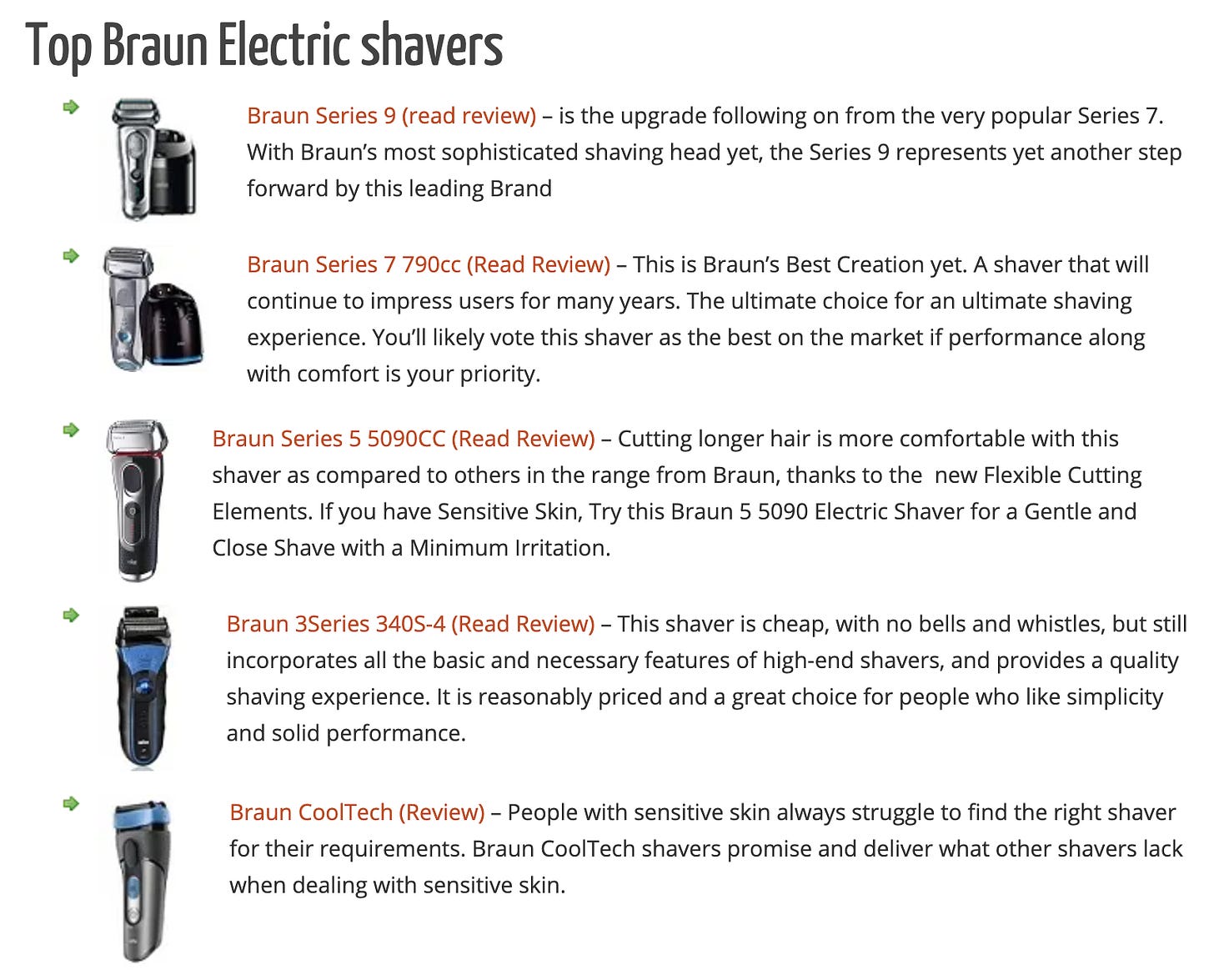
Another example is from pickmyshaver.com.
As you can see, the products here are just listed with a short description. No stats, no prices, no direct link. A link is provided to their in-depth review though.
An example with a hybrid of a list and product details is themicro3d.com. Their roundup posts showcase a list but no recommendations are made.
A few details are given (helpful!) and a price pulled in from the Amazon API (I suspect, although I can’t be sure). It seems as though the grid could be used to showcase a large number of products with the pagination at the top. Is this user friendly? My gut feeling is no, but testing may say otherwise!
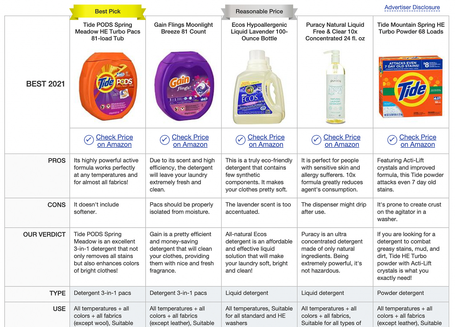
Bestadvisor.com is the final example here - it shows a detailed feature grid for each product, with recommendations for the viewer, along with being above the fold. This might explain why the site is earning the most out of all of the examples shown - a good 5 figures per month from my sources, at the time of writing!
Is there an ideal way to show these?
In short - no.
What works best for one niche may be the worst performer for another. Showing detailed stats may work better for higher ticket price items, or for products that have technical features that are bought based on these comparable features (such as laptops, televisions, or mobiles).
Making the products easy to identify when skimming the page - and following on from that - making the links as easy to click as possible, seems to work well too - as shown in some of the examples here.
What are the best tools that we can use?
Whilst the sites that are doing exceptionally well are probably using custom coded product display grids, there are a few out of the box solutions out there.
The first, and one of the most common is AAWP. With a multitude of options - from grids (it looks like bestroofbox.com above is using AAWP), to single product displays, and detailed product spec comparisons - it more than likely has an option to suit your needs.
It’s customisable through CSS, although it doesn’t look too bad in it’s raw form. I’d highly recommend styling it to match your site though, but that’s outside the scope of this newsletter!
It can be pricey for a new site, starting at 49 Euros per year for a single site, rising to 299 Euros for 25 sites. If you’re serious about your affiliate site though, this is just a business investment that will help to increase your income.
AmaLinks Pro is the other main alternative. It offers a lot of customisation off the shelf - way more than AAWP - without needing to dive into CSS. It’s pricing is reasonable too, at $67/yr for one site, and $197/yr for 25, with a one-time purchase option available too.
That’s pretty much it for off the shelf plugins that support grids! With the advent of Gutenberg, it’s super easy to create your own grids and populate them yourself.
One notable mention is Lasso - it offers super funky looking product showcase options.
And last, but certainly not least - you could use Thirsty Affiliates, or Pretty Links to showcase individual products in your own lists.
To summarise?
In summary - grids are a great way to highlight products in roundup posts. Make sure that they offer something to your users though, above and beyond the content in the article. There is no “best way” to display them, but the one thing that the more successful sites seem to do is to show them as close to the top of the page as they can.
Thanks for reading, if you’ve got this far! What do you use on your sites? What would you like to see us feature next?


