Moving Away from a "Click & GTFO" Affiliate Model
Affiliate Examples #3
Please note: This issue of Affiliate Examples is purely based on my opinions and ideas. It should be considered a thought exercise.
A friend once described his approach to user experience (UX) as “click my affiliate link and get the f*** off my site”.
In simple terms: Put as many affiliate links onto pages as you can in prominent positions so that a user is highly likely to click one. If they never return to your site again after earning you a commission, who cares?
This is a strategy that I’d started to use with enormous success, and was one also employed by numerous large affiliate sites — though I’m sure they wouldn’t describe it in quite the same way as I have above.
A highly-optimised “Best X” or “Top 10 Products for Y” article would have, at a minimum:
A feature grid at the top displaying the top 1-3 products
A table after the intro listing all of the products included
Products listed throughout
A sticky sidebar with the top product that follows you as you scroll
That’s a lot of affiliate links, but it wasn’t uncommon for my posts to have an affiliate CTR of >40%. That makes for lots of commissions being generated — I’d been able to 2-10x the monthly revenues of numerous sites that I’d purchased using this questionably spammy strategy.
However, most of my sites were hit hard in the December 2020 Core Update.
Whilst I had speculated previously that such aggressive use of affiliate links could lead to an algorithmic penalty in the future, and I’m going to include some examples here of sites that also used this “click and GTFO” model and were hit hard, I’m not trying to argue that this is the reason for the decline of the sites — merely that it could be one of many factors.
The idea for including a product grid at the top of posts to encourage users to immediately click an affiliate link without even needing to go below the fold came from GearHungry. Like Wirecutter that we covered in Affiliate Examples #2, GearHungry is a multi-niche site covering buying guides for a huge range of products.
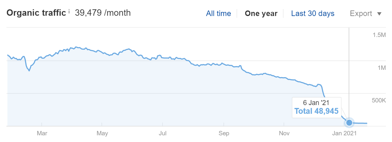
GearHungry, like myself, suffered immensely in the December 2020 Core Update.
And, presuming they were thinking along a similar line to myself, it’s extremely interesting to note that at some point between this Internet Archive snapshot on January 9th 2021, just a few weeks after getting wrecked by Google, and writing this newsletter in late January 2021, they ditched their longstanding product feature grid design, a design they’d been using since at least 2018 if not earlier.
The only design change I can see is that they removed this top feature section, meaning users need to read or scroll at least a tiny bit before being hit with their first large affiliate button. I’m assuming that’s the reasoning behind their decision, anyway.
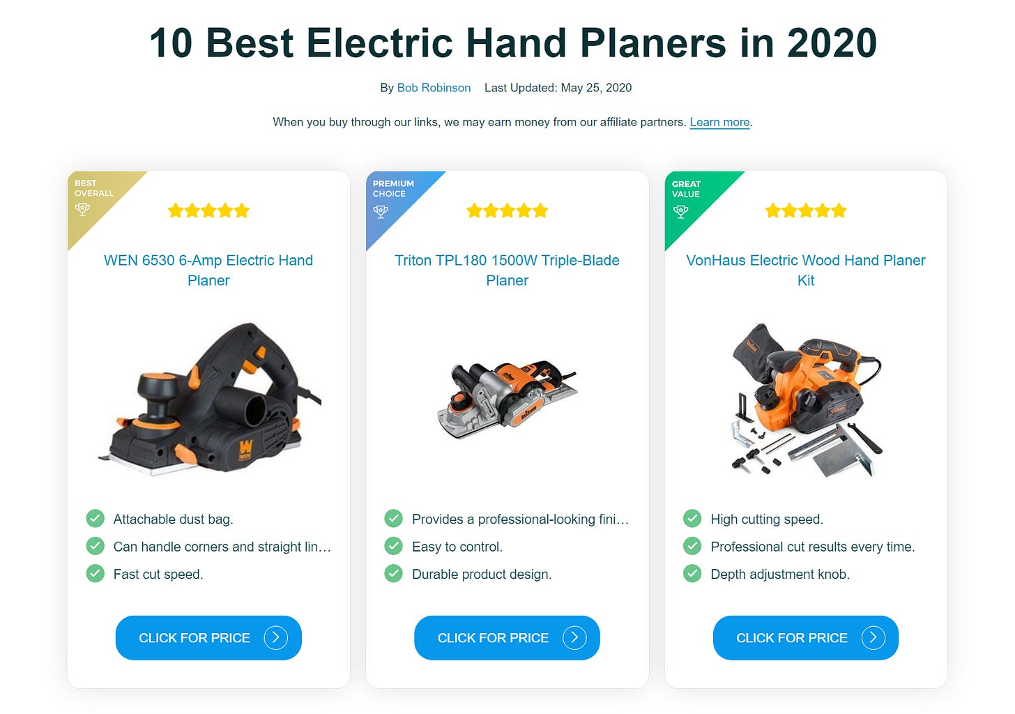
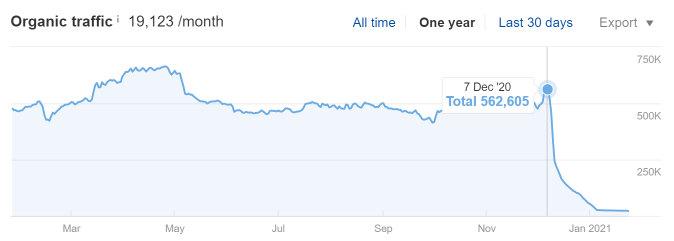
Another site we’ll look at is BestOfMachinery, which was referenced on r/JustStart a few times in 2020 due to its absolute explosion in growth, who are still sticking with this design choice at the time of writing.
Ahrefs suggests that BestOfMachinery went from an estimated 562,000 organic visitors per month before the Core Update to around 23,000 after it. Big yikes.
Why am I highlighting this choice of design specifically? Because I think it demonstrates the “Click and GTFO” mentality perfectly. Before a user even reaches the intro of the content they’re already seeing 3 products with affiliate links added to the product name, the image and a ‘Click for Price’ button. That’s 9 above-the-fold affiliate links.
To me — someone that openly admits making pages like this and still owning websites with pages like this — these are doorway pages and probably don’t deserve to rank.
So, what should affiliate marketers be doing instead?
De-optimising for CTR, Optimising for UX
Before I start this section, you might argue that providing the products and links upfront could be considered good UX. I would lean towards agreeing with you. However, doorway pages are not good for Google, and therefore I’m encouraging you to think of a different style of UX for your affiliate pages.
The biggest shift I think sites that are hit should make is going from optimising for affiliate CTR to optimising for a longer session duration.
Huge caveat: there are many flaws in the Google Analytics Session Duration-related metrics, and obviously having a user stick around for a long time unnecessarily, frustrated that they can’t find what they’re looking for, is not a good thing.
Instead of Click and GTFO, we should be thinking about something more along the lines of Hook, Read, Click. Entice a reader to begin digesting your content and ensure they take value from it. Ultimately we still need them to click a link at the end of it or we’re not going to make any money as affiliates.
If you offer compelling content — we saw in the previous issue of Affiliate Examples that even a buyer’s guide to the best canned tomatoes can be interesting — users will want to actually read what you’ve written, rather than skipping past the drivel your 20th $0.02-per-word Upwork writer sicked up.
Perhaps this is just me, but if I’m looking for a product recommendation and I land on an affiliate post and I can see the content is absolute waffle, I’m more inclined to immediately bounce.
If I land on a post that is actually useful, I’m more inclined to stick around and read. And reading is not a hobby I enjoy — damn, guess I’ll never be a guru.
For example: When looking for the best camera for recording YouTube videos with, an extremely useful introduction to content would be an outline of the main things I need to look for — without any padding. I don’t need to know why having a great camera for YouTube is really important. I already know that. That’s why I’m searching for the post. What I need to know instead is the specific features I should be looking for (24FPS? 60FPS? 4K?) and maybe a minimum budget I should have in mind for acquiring something half-decent.
If a post succinctly explained what I should be looking for and then hit me with product recommendations and affiliate links — and they’d highlighted why they’re a good recommendation — I’d be much more likely to give them the click they need to make money.
Not only would they have got the click but they’d have had a user that was genuinely satisfied with the experience, which should hopefully be demonstrated in session duration lengths or other more suitable metrics Google might use to determine UX.
If a user finds your post valuable, the chances of them sharing or linking to it increases significantly.
I really don’t see a reason why anyone would ever share or link to a bog-standard Amazon affiliate review. That’s clearly a huge issue for the long-term success of a site.
My advice: de-optimise your posts for CTR, but optimise them for a greater UX — one that will encourage users to enjoy your content and be more likely to recommend it to others.
Move content away from only being valuable to you as a site owner and put the priority on the reader. You’ll still make money.
This issue of Affiliate Examples was published by Luke Jordan before giving the project away. For more info on this, watch here: https://youtu.be/AQZ8M9LI0Ew


